Dear World: This Paint Color Looks Like Dehydrated Dog Puke
I’m Ash, and I’m a writer, traveler, nonconformist & nomad, and every week I’m sharing funny field notes from around the world. Currently, I’m in America writing about what it’s been like to return home to my small town, twenty years after living abroad.
There are only three things worth being obsessed with in this life:
- Barack Obama’s face *swoon*
- The deliciousness that is Carmenere wine (when I lived in Chile, we were one)
- And not being a total wad when it comes to picking out paint colors 🎨
Which I say lovingly, of course.
I have been that wad!
We ALL have been that wad!
By the way, ‘wad’ is my new favorite thing to call myself when I’ve just almost caused a huge house fire (or, like, hung a shelf so crooked it became modern art). But, it’s also what I like to call myself when I royally screw up and paint the room….the wrong color.
There is no worse fate!
Except maybe dropping your phone in the toilet at a Taco Bell.
So naturally, scholar that I am, I have been studying paint. Like a lot of paint. Like, graduate-level studies of these liquid lies. (I mean, SOMETIMES they are liquid lies. Which is why I’m writing this. 🤣)
In my research—by which I mean ‘me schmearing bullshit onto the walls to see what happens’ I have discovered that there are some very big no-nos that you’re gonna want to know about.
No-nos like:
- If the room doesn’t get a lot of light, don’t paint it blue, you sick bastard.
- If your trim looks like a 100-year-old pervert who’s been chain-smoking in a wind tunnel, do NOT pick the glossy finish.
- If you want to paint your hallway white, you should probably walk into the ocean.
- If you have a warm, honey-colored 90s oak kitchen, the paint on your walls needs to be warm and creamy—or else it will look like absolute trash.
And, guess what?
There are legitimate, real, scientific reasons for this!
Reasons that I DID NOT KNOW until I went down the rabbit hole of the paint world, and realized that picking out paint for people is literally an entire profession.
So alas, here I am, ready to share with you the sacred rules of paint that, apparently, ARE A THING (which I only discovered after ruining three rooms, my dignity, and one perfectly good pair of sweatpants).
Are you ready for ~the rules~?
I know, we hate rules, but these rules are actually superb because, like I said earlier, you will look less like a wad.
The Idiot’s Guide to Not Living in a Porta-Potty Shade of Green
Rule #1: No f*cking sun? No f*cking blue.
In low-light rooms, blue doesn’t look fresh—it looks dull, clinical, and cold. That “airy sky blue” you picked from the swatch? In a north-facing room it turns into full-on prison chic. You need warm sunlight to keep blue from looking like the waiting room of a free clinic.
Rule #2: Trim that looks like it got into a bar fight = matte paint. DID YOU HEAR ME???? MATTE PAINT!
Yeah, I once thought I’d be cool, too, and use matte on the walls and a slightly shinier finish on the trim—you know, so the space could look LaYeReDddDD. With dimension! And sophistication! So I could look pro. So everyone would know that, ahem, I OWN ALL THE FARROW & BALL BOOKS, THANK YOU. But you know what happens when you use glossy paint on old, beat up trim????? It’s like squeezing your ass into a shiny spandex onesie, AKA it shows *everything*. The answer: matte paint. But not just any matte paint. Farrow & Ball’s ‘Dead Flat’ is my fav, because it looks matte, but it’s also tough as nails. (Which is normally the biggest benefit of satins and glosses.)
Rule #3: Do not even JOKE about using white paint to “make it feel airy.” It’s going to feel as airy as your armpit.
I know. I KNOW. You’ve got that dark-ish hallway. Or that guest room. Or that powder room. And you want it to feel light, and bright, and airy, and clean! So what do you do?????? You go to the store, and you pick out a white paint that’s light! And bright! And airy! And clean! And then you bring it home, you paint the room, and you immediately want to crawl into a coffin. Because instead of “airy and clean,” it looks like the inside of a dental office. That’s because white walls look best where there’s tons of natural light. Without it, the shadows make it look gloomy, cheap, unsophisticated, and gray. Like your ex-boyfriend’s dead tooth. (I’ve been there. Not the dead tooth. Well, maybe. But I mean, I’ve definitely stood in the paint aisle, clutching a swatch called Cloud Whisper, thinking it was going to change my life. Spoiler: it did. It made me hate my hallway, no matter how many coats I put on.) So, rule of thumb? If the room already feels like a cave, painting it white will only confirm that yes, you are, in fact, living in a cave.
Rule #4: You HAVE to match the undertone of your paint, to your cabinets / counters / couch / whatever big item you can’t hide.
You got those oak-colored cabinets from the 90s? They’re orangey yellow, right? They’ve got warm undertones. Which means that if you go to pair these creeps with a stark white? Which you are probably going to try to do in the hopes of “freshening it up?” (I know, it sounds so right!) Then you’re accidentally pairing warm undertones (cabinets) with cool undertones (stark white), and what happens scientifically is that the cool undertone in the stark white makes the yellow-orange in your cabinets scream louder. Instead of looking “fresh,” your cabinets will look even more orange, and your white will look even more blue, and together they’ll create the aesthetic of an airport Cinnabon. Instead? Go with a warm, creamy white, you silly little shit. (Ditto if your sofa is warm, you need warm paint colors, and vice versa.)
Okay, I have tortured us ALL enough for one day.
But don’t you worry: I’m still out here with a paint brush and a dream.
My next task here at Elizabeth Gardens (what I’m officially calling the farmhouse + cottage property, after my mom!).
Painting the brick fireplace.
It was *already* painted white by the sellers, but it’s time to add some ✨ drama ✨.
I’m going with Little Greene’s ‘Harley Greene’ because it pairs perfectly with the background of the House of Hackney Opia wallpaper that I have in the next room (which you can see from the fireplace).
Here they are:
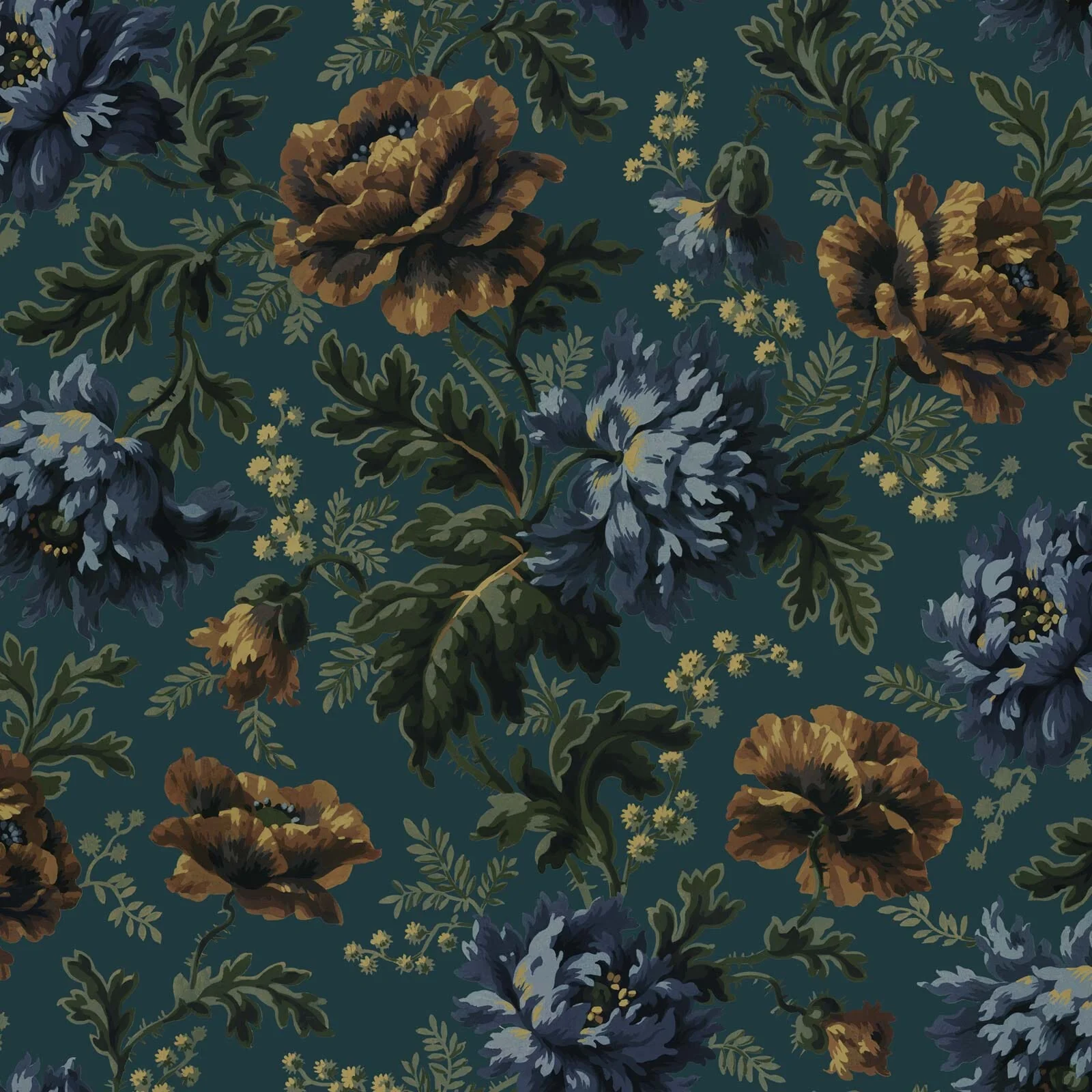
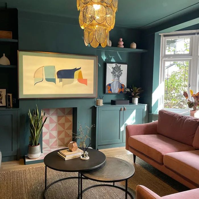
I shall report back, when I screw this up and ruin all our lives.
What do you think—any other paint rules I should know about before I destroy this house?????? Leave me a comment! I need all the help I can get. 💃
XXXXXXX,
Ash
P.S. Subscribe free to get tomorrow’s “guide,” hahahahahahahahahaha. ⬇️
ChatGPT gave you the summary.
I give you the rest. Live experiments in remote work, publishing, and AI, from someone who’s been doing this for 17 years. (Still not a newsletter about fish.)
Liked the short answer? The long ones arrive by email.
Do Extraordinary Work. From Anywhere.
I run business experiments in remote work, internet publishing, newsletter growth, and using AI to make your projects pay so well your Stripe notifications start sounding like a slot machine at a Reno bowling alley. This is not a newsletter about fish.
Free. Daily or weekly, you pick.
From the Penguin Random House author seen in The New York Times, The New Yorker, The Guardian and The BBC